
UX/UI and Graphic Designer
Tools: Sketch, Adobe Suite, Invision, Pencil & paper

Overview
Vitasave is a 100% Canadian owned and operated natural health eCommerce company headquartered in beautiful Vancouver BC, with a retail store in North Vancouver and a flagship store downtown, as well as warehouses in Vancouver and Toronto.
“The Vitasave mission is to make health accessible and affordable for all Canadians”
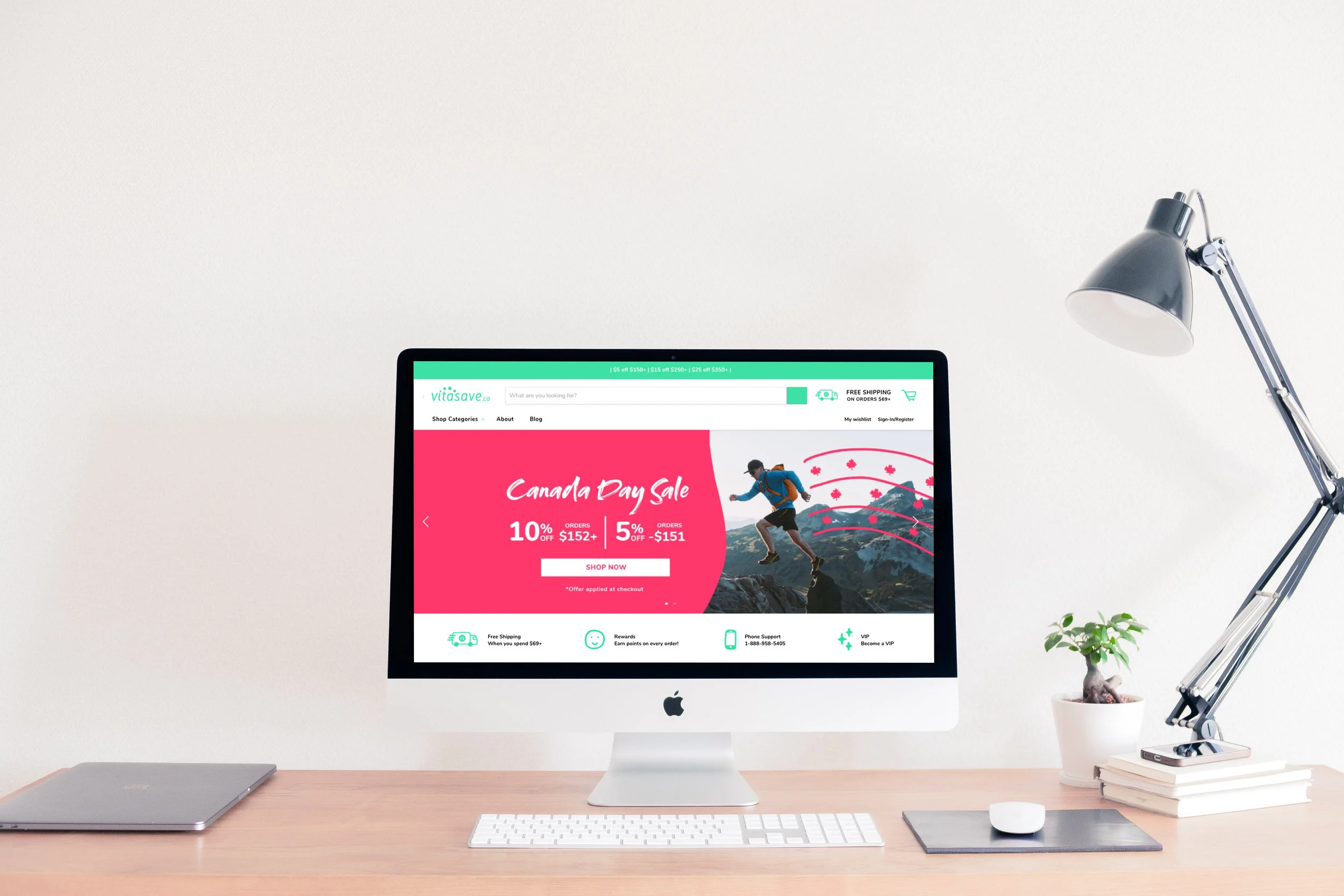
Shopify
Vitasave made the switch to Shopify in Winter 2018.
I wanted to research our users to get an in-depth understanding and to create a better online experience.
UX Research
I began with Domain research, looking at our competitors and seeing what they were doing. Many of the health websites that I found were dated and not aesthetically pleasing. Focusing heavily on sales and not the functionality.
To gather data, I created two surveys. One for our current customers and the other for those who shopped for health products online but had never shopped with Vitasave before. This was not only to gather data from our users but also to find out why users shop with other health supplement companies. I gained valuable qualitative and quantitative data from both Canada and Europe.
I asked questions such as:
When shopping for health products online, what websites do you use?
Do you read health/wellness blogs?
When buying online do you have any of these concerns? Damage in shipping, misleading info, not arriving on time.
What colours do you associate with health?
How much on average do you spend on health products a month?
What does Vitasave mean to you?
During my research, I conducted six interviews. Each of whom gave me a different perspective. It was great to get direct insight from our customers. Listening to their frustrations with the current site, hearing why they shop with us and learning about their journey to good health. The takeaways from these interviews were that our customers loved Vitasave, especially the customer service, speedy delivery and the price. Their frustrations were, the slow speed of the site, the navigation, search bar and not being able to find deals all-in-one page.
The site was old and dated. Categories were misleading and subcategories in wrong sections of the site. For example, the category “Baby” was hidden in “Household” and a section called “Shop Values” had categories such as “Gluten free, soy free, dairy free”. Users were often lost in the site and unable to find the products they were looking for. I went through each category of the site and designed an up-to-date site map that would be better our users needs and goals.
Shop Values was moved into the drop down menu. Changing its name to “Shop by Diet”, which is a more accurate description of what it contains. A category called “Conditions” was turned into “Family Health”. To me, conditions seemed like a very harsh name for a category. From my research, a lot of our users were mother’s shopping for their families. We turned this category into Family health and added suitable sub-categories. Having the right name for a category, gives our user less time to think about where they need to go in order to find the right product. From interviewing customers, I found that users loved deals. They wanted to have a page where they could find all the current deals online, from that, I created a deals page and added it to the menu.
When interviewing some of our users, they really wanted to see more of the faces of Vitasave. As many of them shop only online, they had no idea of what the stores looked like. I added more images of the store, store staff and health educators to give the site more personality.
Customers were constantly frustrated with the lack of speed to our site and not being able to checkout easily. I cleaned up the users flow, by having less clicks. Keeping the form design simple and adding auto-fill, so returning users do not have to add in their information again. Our users also loved reading product reviews, but noted that there was not enough reviews on products and that the reviews were not informative. To encourage our users to give a review, I created a follow-up email. The email would be sent out to the customer to ask if they would like to provide feed-back on the product they had purchased.
UI

Above: added images of our store staff, store and health educators to give more personality and warmth to the brand.
Rewards page & warehouse locations page.
The rewards page needed to be fun and inviting to get our users to sign up for our rewards program.
From my research, I found that many of our users were between the ages of 25-35 and 55+. This page needed to speak to a younger audience as well as our older audience.
I used clear, large icons with easy text that flowed together and lead the user down the page while keeping in mind our brand guide. Having a cta at the top as well as at the bottom of the page to remind our users to sign up to the program. Many of our users could not find any information on our warehouse locations. This information was hidden in another section of the site. I decided to create a page just for this, adding this page to our footer.


Reward points banner. This banner appears when the user signs in to his or her account.

Become a VIP landing page
Vitasave’s VIP program had been launched when the company began. They wanted to redesign their old VIP page into a more modern and attractive page to gain more sign-ups.
My initial proposed new design on the left and the final design on the right. Vitasave wanted a more active family, so the right was chosen for the page.
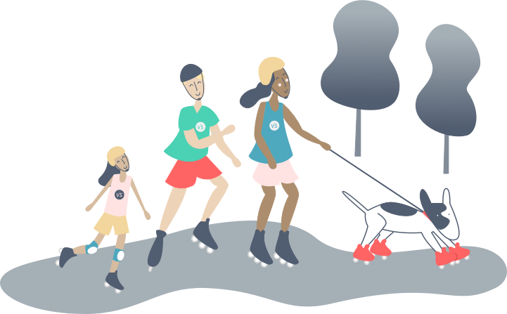
VIP active family illustration.
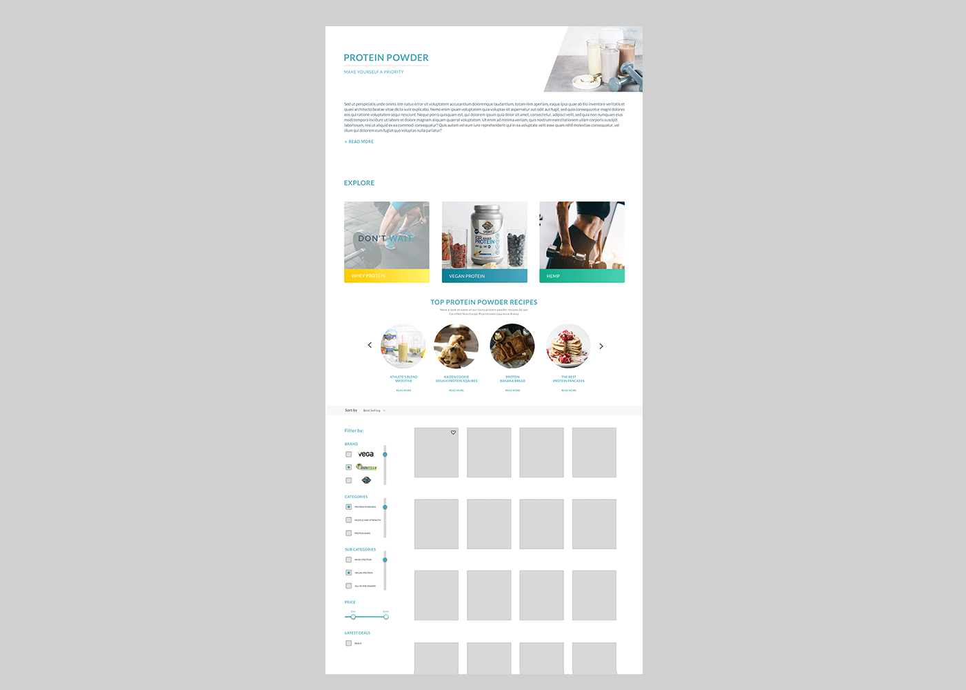
Protein Powder page
One of my goals was to update or most popular page “Protein Powders”. From research, I added our most popular protein powder categories to the top of the page for easy and quick access. On hover over each category, the user is given a small motivational word to encourage the user to click through to the category. Feedback from our users was that they wanted to see recipes and ways to use the products. I added a slider that the user can control, moving left to right. Recipes on this page is also another excellent way to keep users on the page longer and to get them inspired to buy protein powders.
On the side, I designed a custom filter for our users. This was created from going through the user flow and customer user journey of making a purchase. I gave testers a task, to buy protein powder. From testing, I made many iterations and found that these filters were the best for our users. From my research, I found that our users loved deals. Users wanted to find deals quickly and easily. We added a deals page to the menu and deals filter on the side.


Print
Work done for Vitasave’s new Robson store location. On the left, recycling stickers and quote. On the right, a large print of downtown Vancouver with the beautiful mountains in the background. Vitasave wanted a mural image to cover this entire wall that would really showcase our wonderful city. I found this image from a local photographer. Vitasave wanted an inspiring quote across the image, which was printed and installed separately. Liaised with printers and photographer to meet deadline.

Billboard designs to promote our new store open on Robson street, Vancouver. Designed and liaised with Pattison, to ensure that print and installation was seamless.
Smoothie cup designs
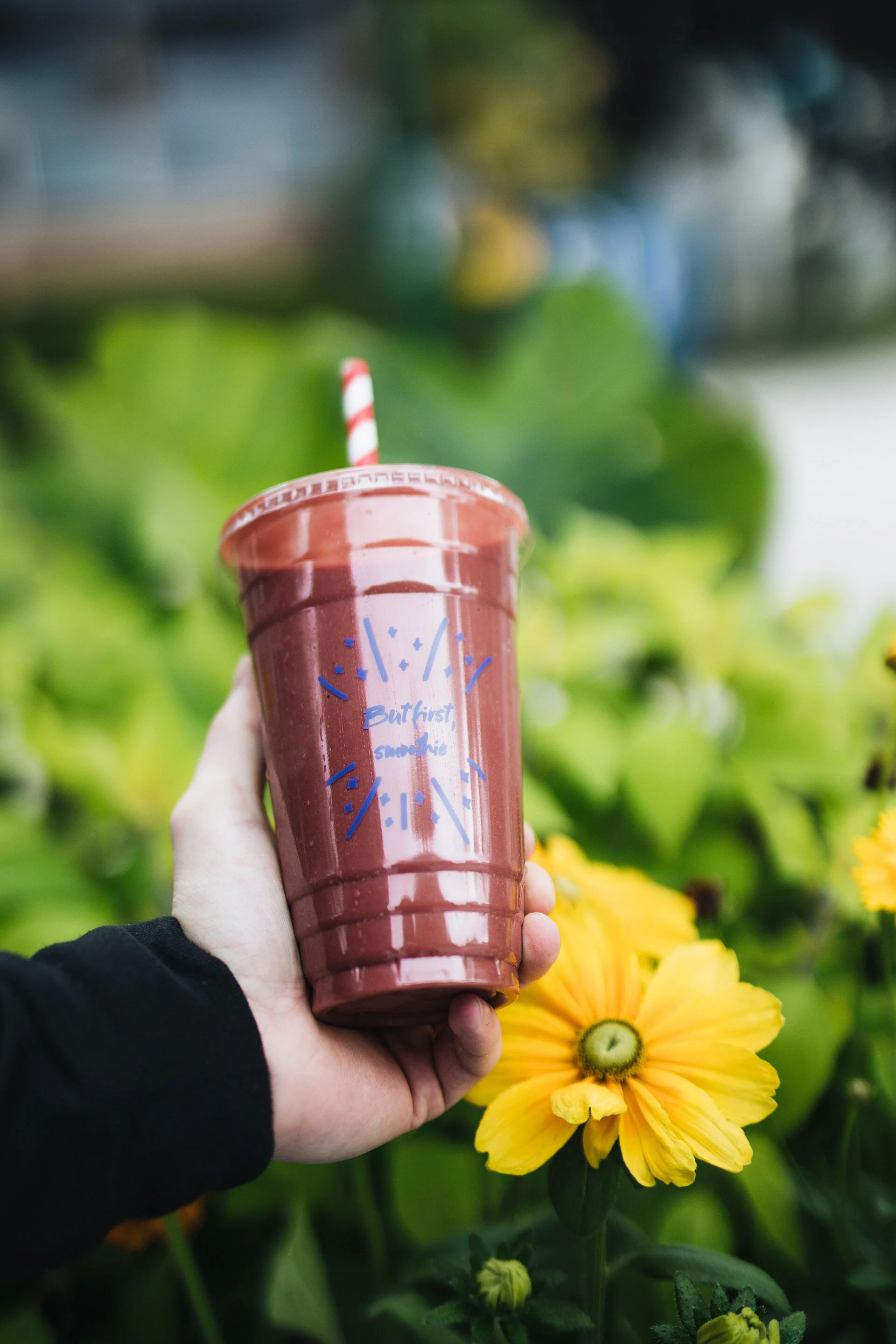


Reusable smoothie cup designs.
I was so happy to create these designs, to encourage our customers to make the switch to reusable cups.


Print
As part of our grand opening sale campaign, I created a full page spread design in the Georgia Straight.
